Monday, December 27, 2010

page 32-37


Sometimes doodles can turn into projects. The characters on page 32-33 (top), are minions for a comic I have in mind (currently titled: "Action Nancy"). In the middle, this doodle served as my Noah character for an animation project (see proj. at "my Art" blog). On the bottom image I'm just doodling for fun.


Thursday, December 16, 2010

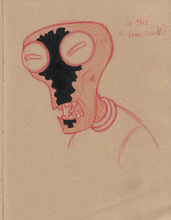
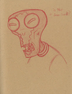
Page 39: Inspiration


You never know where inspiration may come from, so take everything in.

Before bed, I drew this character and had no idea where it came from. He looked oddly familiar, and in the morning, after asking my roommate, he said it was from Ben 10. So, not knowing, I had drawn my own twist of a Ben 10 inspired character.

Wednesday, December 15, 2010

Page 28-29


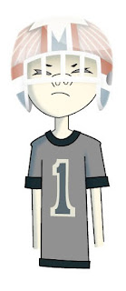
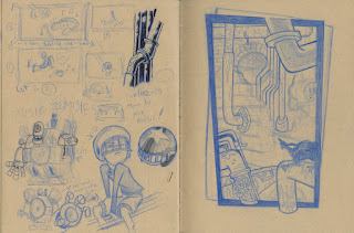
Every now and then I sketch out ideas for animation. This page includes the first doodles of a storyboard, character sketches, and environment concept/styling (on right). Recently I've started to play around with illustrator using such sketches in hopes of developing my ideas further. Check out my ART BLOG to see color tests on the main character's helmet.

If you're unfamiliar, one of my big influences is the work of Jamie Hewlett, most notable for the comic Tank Girl and the characters of the virtual band, Gorillaz. To me, his work feels highly original, with characters designed of individual qualities, and a rich graphical style with free, spontaneous energy. In addition, the Gorillaz music video's have been a huge inspiration in animation. The video's help show how mixed-media animation can be accepted and even marveled by large audiences, keeping the experimental qualities of animation ever more alive.

Saturday, December 11, 2010

Page 11: Progress


Gouache WORKS!!!!!! I used REEVES Gouache Color Set ($20), and sure they were cheap, but all I needed were 2 layers to really get the paint flat on paper, so not bad. Hope you enjoy!

Tuesday, December 7, 2010

page 26-27


These sketches were actually part of a larger project. To check it out, go to my art blog, under "My Blogs" on the top right.


Saturday, December 4, 2010

page 22-23: Animal Observation

With this sketchbook, I'm trying to separate certain pages for categories of things.

This way, you can get really thematic pages which, I think, help for an overall look.

Tuesday, November 30, 2010

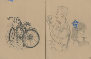
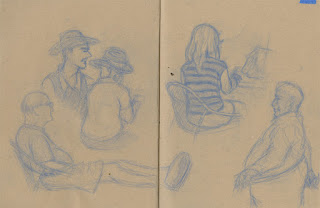
page 12-15: observation 2


Tip of the Day: when lifedrawing, try different mediums and different styles.

Note: Cartoony styles may not come easily at first. Just keep drawing & do your best. Try to start with Caricatures. Most importantly, try to INTERNALIZE YOUR OBSERVATION,
then spew it out on paper.

Monday, November 29, 2010

page 11: Monk 1


This was probably inspired after reading "The Art of Happiness" (really good book, with many essential & practical teachings by the Dalai Lama!)

I can't wait to go back to this page with some yellow acrylic or gouache!!!

pages 06-09: observation 1


--Firstly, I must apologize for the censor bars. It's just in respect to others' contact information and things like that.--

With observation drawings, you will have your good and bad days. It's just important to keep drawing!!! In the beginning, you probably will get more crummy than good stuff...but it's all in to what makes a professional (I'm still really trying). I think it's important to keep striving for better work, and once you're really good, try something new. Experiment!

page 00: Cover

Tuesday, November 23, 2010

page 2 & 3

I think it's about time I start posting full pages. But I will, however, continue to show accompanied cropped pictures just to focus on a subject. Hope you enjoy! ; )

Sunday, November 21, 2010

Tip 2: observation


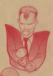
observation of a nervous guy accepting his tony award (it's like the Oscars for Broadway theater). Other inspirations: Nico Marlet - Character Sketch Artist for Dreamworks Animation Studio

Character Sketching Tip 2: Oh! A great quality to remember when drawing!!! Using tonal changes/ gradients! It gives your drawing more dimension, variety, and creates emphasis/focus---all in all, making it more eye candy

Sunday, November 14, 2010

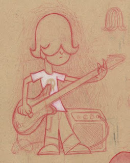
character Tip 1


This character was influenced by the sharpness of Dexter and design qualities from Foster's Home for Imaginary Friends, which I see as being iconic, representative shapes.

A *BIG* inspiration was Mac (Foster's Home...), only if he were older, in a rock band phase, and became way too passive in lifestyle. I can imagine this character being all like, "...(silence)...whatever..." then he'd go back to playing his bass again.

He's more of a secondary character (we don't see his eyes, so there's less connection between us and him).
So, he's mostly in the background, but he is that quiet friend you can depend on to agree with everything you say (regardless of his answer, "whatever").


CHARACTER DESIGN TIP 1: try to give your characters props & or setting that best reflects them, or tells a story. You can show your character at his/her best, or worst, or anything in between.

Friday, November 5, 2010

The Magic of Mid-Tone


The best attribute of drawing on mid-tone paper is that you can add *highlights*. Although I didn't necessarily use the white to do that (which you're not limited to), I used white for its own color. So you can give characters AWESOME white hair!!!

So What's This About?

I wanted to start this blog out of my love for sketchbooking and, as of recently, from my joyous experiences in using my first mid-toned sketchbook.

The blog doubles as an updater to my sketch work.

You'll see my progress work through revisited pages. I also plan on posting finished work based on some of the sketches, as well as experiment work with different mediums to explore what we can do in a sketchbook & how we can add to our sketches.